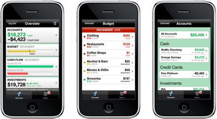
Mint – iPhone App Review
From hearing that Mint.com had released an iPhone app and opening the app for the first time, I think I had let about 3 seconds pass.
 If you’re one of the 500k people who use Mint and also own an iPhone, I suspect you had just about the same reaction. The funny thing is that I only started using Mint about a month ago and I’m completely in love with it. The fact that all I have to do is open the app and I can see all my up to date financial info… is astonishing.
I had written a post a while ago about some concept iPhone apps I’d love to have, and an HSBC app was on that list. My reasoning was that I hate having to spend so long each time I log into my bank account online. I thought with such a flexible platform such as the iPhone, there much be a quicker way. Unfortunately there wasn’t a way to connect directly to my bank account over the iPhone… keyword being “directly”. Mint’s iPhone app allows me to indirectly view real time account information including the available balance, and transation history. So instead of creating a mock-up of what an HSBC iPhone app might look like, I’m going to pump up Mint’s tire here a bit and give them a review.
The good stuff:
- Cool badge graphic (seriously it’s important to me)
- Simple interface – The only sections which you can ‘click’ to from the front page are: “accounts”, “budget”, “cash flow”, and “investments” but most of them go 2 more levels deep. For instance, you can go to Accounts > checking account > transaction history, and it will show you a list broken down by day with the merchant, category, and total amounts listed.
- Robust feature set – As far as I can tell the transaction history goes all the way back to the beginning of your record – and fast. The interface is minimalistic and fairly usable. Being able to break down your information by budget or cash flow, and by category, time frame, or merchant is really more than I would have asked for in the first release of this app so I’m not going to complain here.
Stuff I’d like to see in a future version:
- Investment account details – as it stands now you cannot view any levels beyond seeing the total value of your investments. Wheras on the web app, you can do all sorts of cool stuff like tracking the performance of each individual stock, etc.
- Better usability queues – I find it annoying that the investment section doesn’t look like you can’t click an account. It looks like the other pages where you CAN click the account and get more information. At the very least add a colored border to clickable sections or something.
Summary
This is a solid iPhone app and should be on the front page of your iPhone if you are a Mint.com user. I have no idea about any plans for new features but I know that as soon as I see it the Updates section of the app store I’ll probably have another total nerd meltdown because I’m a total app store geek 🙂


